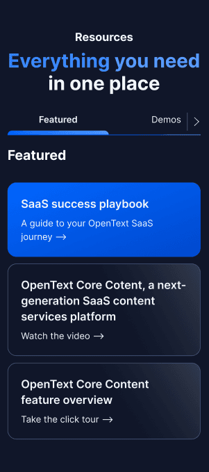
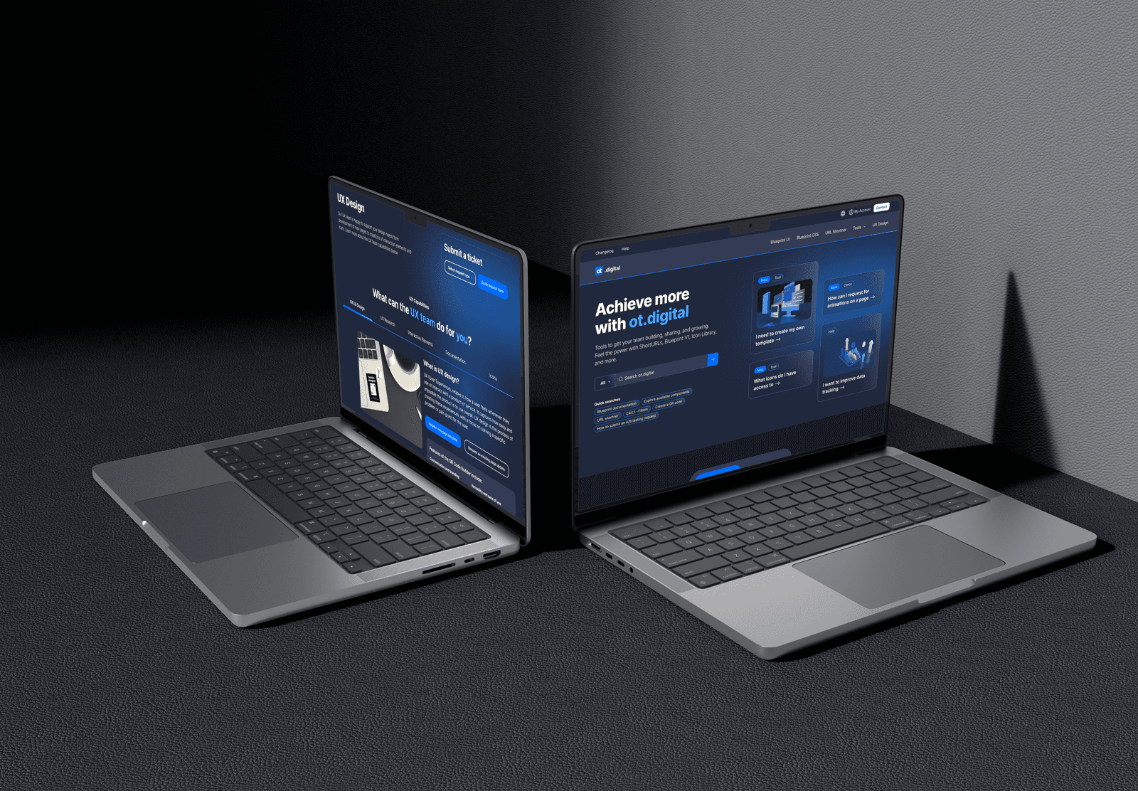
SAAS product pages
SAAS product pages
SAAS product pages
A collection of contemporary SaaS website templates, including a new Design System.
5x
increase
in free trial subscriptions
5x
increase
in free trial subscriptions
5x
increase
in free trial subscriptions
Wide
adoption
of the new design system across multiple CMS
Wide
adoption
of the new design system across multiple CMS
Wide
adoption
of the new design system across multiple CMS
Full
alignement
with the product UI/UX
Full
alignement
with the product UI/UX
Full
alignement
with the product UI/UX

Team lead
Team lead
Team lead
Figma
Figma
Figma
Adobe CC
Adobe CC
Adobe CC
Jira
Jira
User testing
User testing
Jira
Jira
User testing
User testing
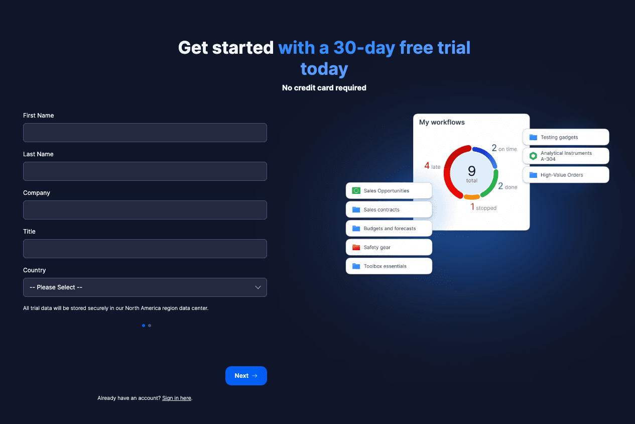
The Goal
To lead a strategic website redesign to our Software as a Service (SAAS) products by delivering a modern, user-friendly experience that aligned with our refreshed product UI and elevated our brand presence. My vision was to seamlessly integrate key touchpoints — including sign-up, sign-in, product education, campaign management, support, and marketing — in order to create a frictionless journey that made users feel informed, supported, and confident. The corporate goal was to see a significant lift in free trial sign-ups and a stronger emotional connection between users and our SaaS products.
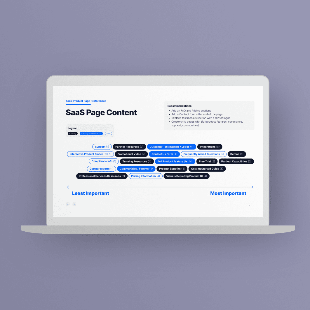

The Process
Research and Analysis: We conducted user interviews, surveys, and analyzed the business needs. Additionally, we studied our competitor’s SAAS-style websites and design trends.
Information Architecture: Based on the research findings, I organized the content, prioritizing features and information based on user personas.
Wireframing and Prototyping: Designed low-fidelity wireframes to visualize the new layout and navigation, iteratively refining them based on user feedback. Subsequently, I built a high-fidelity, interactive prototype to test the design.
Usability Testing: After the initial launch, the team conducted usability tests with a diverse group of users to validate the design and identify areas for improvement. Based on the feedback, we made necessary adjustments to the design.
Visual Design & Style Guide: We developed a new design system, new style guide, including color schemes, typography, and iconography, ensuring consistency throughout the site. Also created a style guide to maintain design consistency in future updates.
The Result
Within weeks of launch, the redesigned website drove a 5× increase in free trial sign-ups and boosted scroll depth by 10% above industry benchmarks — signaling stronger engagement and user curiosity. With 30 new components and 4 adaptable page templates, the design system was quickly embraced across multiple CMS platforms, creating a ripple effect of consistency, efficiency, and pride across teams.